A Pattern Language for Interfaces
System → Programs → Apps
Is this a design language?
No. Silicon Valley “design languages” are languages exclusively for the designer to speak to the user. The user is not given an equivalently expressive language to speak back with: the Silicon valley designer believes that the user has nothing valuable to say beyond affirmations and grunts. A "design language" is a language of sermons: preachers do not tolerate interruption of their mass with questions and commentary. The language I want to build is a language for conversation amongst equals.
Notes
- Focus on the forces. For example: force: forgetting/losing context vs. the need to know where you are.
- I have no opinion as to whether these are implemented in the core of a system or as plugins. The distinction is meaningless if you follow the Extremely Late Binding pattern.
- Terminology: windows vs. elements. Windows is sadly already loaded w/ bad meanings. But also, "element manager" feels obscure.
- I absolutely need inline pages to do this right. I need to see the whole structure in front of my eyes. Even better would be to lay them out by category.
- I want to avoid explicitly saying the system should be modifiable. take: Modifiability is not a valid pattern? Maybe it should emerge from other more basic patterns.
Patterns
Performance**
https://www.inkandswitch.com/slow-software.html
See also Lightweight Processes
Full-screen any element
For people to realize their goals, they often need to narrow their focus on a single element.
Full-screen controls let people expand a single element of an interface to occupy their whole screen, letting them ignore the visual clutter of unnecessary UI. But a designer cannot hope to anticipate every possible thing the user would like to view in a full-screen.
Therefore:
Provide a mechanism for every widget to be full-screened.
Notes:
Even as I write these patterns, I feel the need to rapidly full-screen a single pattern page to narrow my focus on it, knowing I'm inside of a whole. I must implement this in

Hide/Collapse any element**
But provide an obvious way to find it again via Visible Structure or Version Control.
Ubiquitous, scopeable search
When navigating deeply nested information hierarchies, we often need to
Therefore:
Allow any string to be searchable in the system. Make it scopeable over a particular portion of the graph to control the results. Allow results to be shown in-context.
Search should apply over the available actions/commands too(with a means to filter them(this suggestts a need to be able to quickly point to just the actions of a card-object)):

Notes:
- Examples: rga, which works anywhere in a directory hierarchy.
- The way I use search in this very Notion document reflects this. If each pattern were its own page, I couldn't scope the search by the page, making it feel disjointed.
- how do you select a scope? How do you understand that a selection might be applied deeply to a hierarchy. How do you understand that a scope might be over a graph, and that there is a depth to such a graph and that there is a limit to this depth.
Scopeable Actions
Reflection
Elements should expose the commands they have available.
Draw everywhere
https://szymonkaliski.com/projects/hhann/
Version Control*
https://szymonkaliski.com/notes/handling-history-in-software/
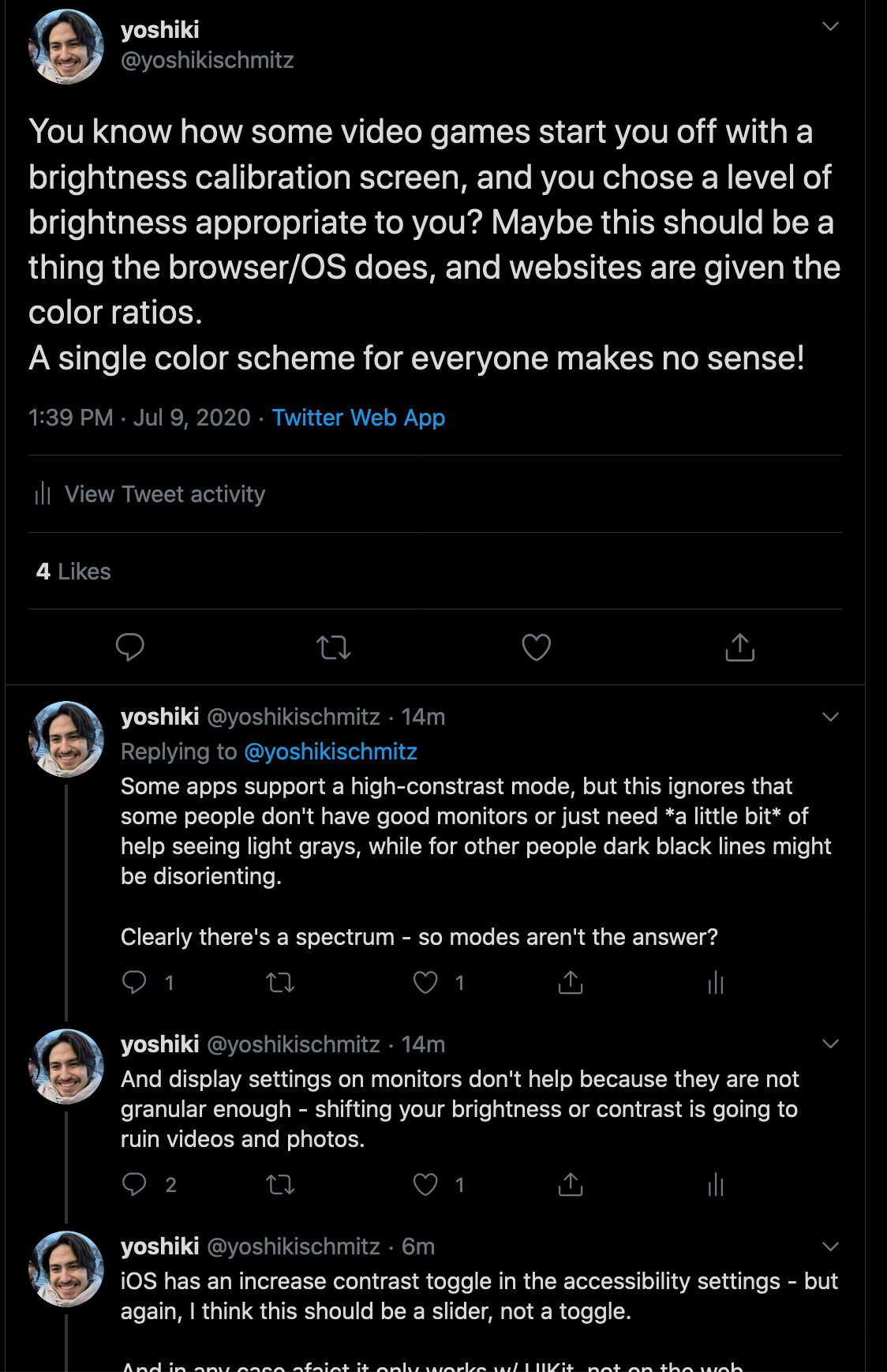
Appropriate Contrast Ratios*
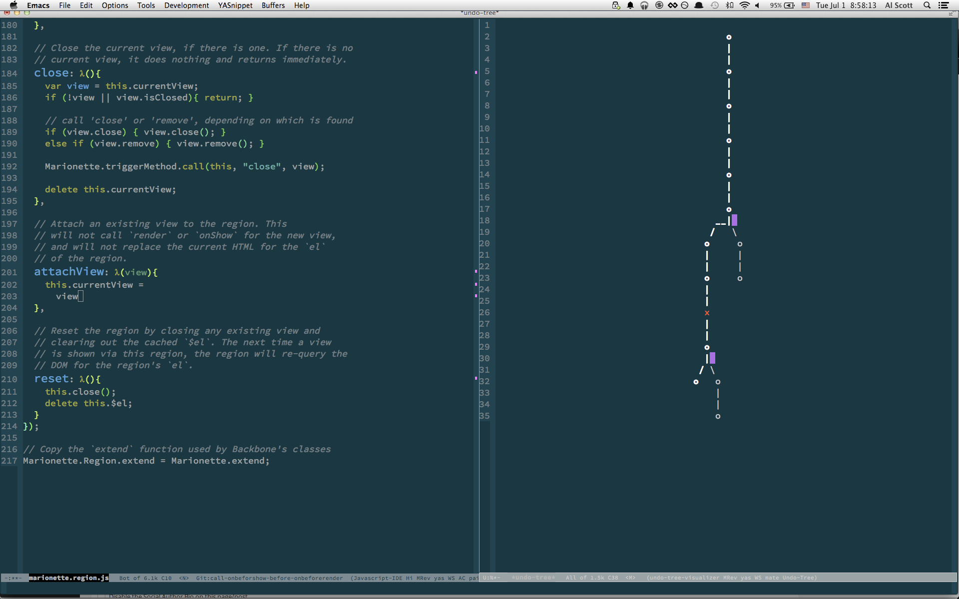
Unlimited Undo**
Access Controls*
Links
Combine with deep addressability.
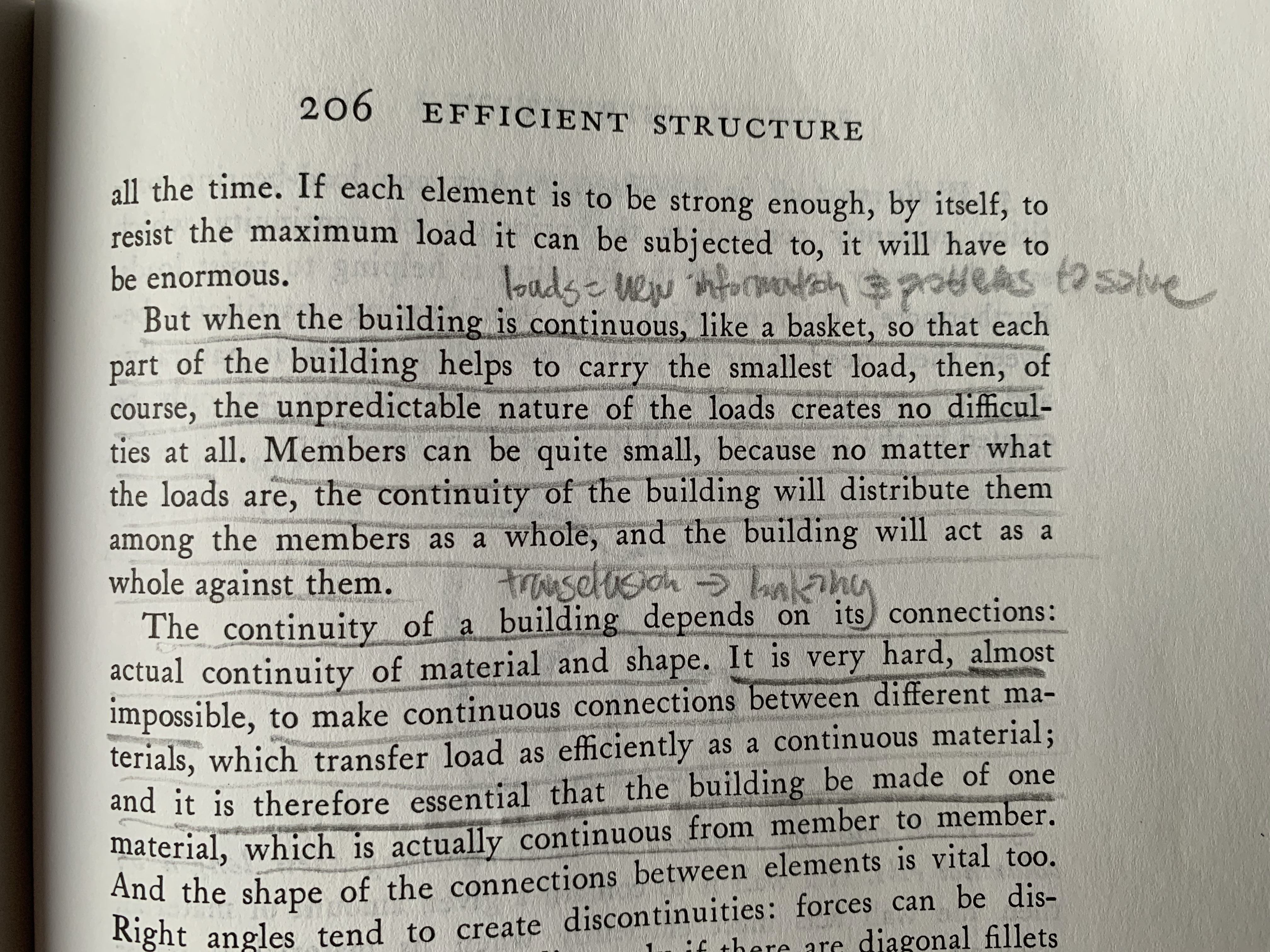
Links create connections, connections create resilience. New elements can be softly absorbed into the system and made continuous with it via linking. Like Alexander's basket, the load of new information, tasks, and external events can be distributed throughout the network structure, rather than concenttrating them inside of a todo list, where they will cause uneven point-wise force(think of a needle) on your digital fabric.
Deep Addressibility**
Zooming User Interface*
Ubiquitous Embedding**
See: Notes Anywhere
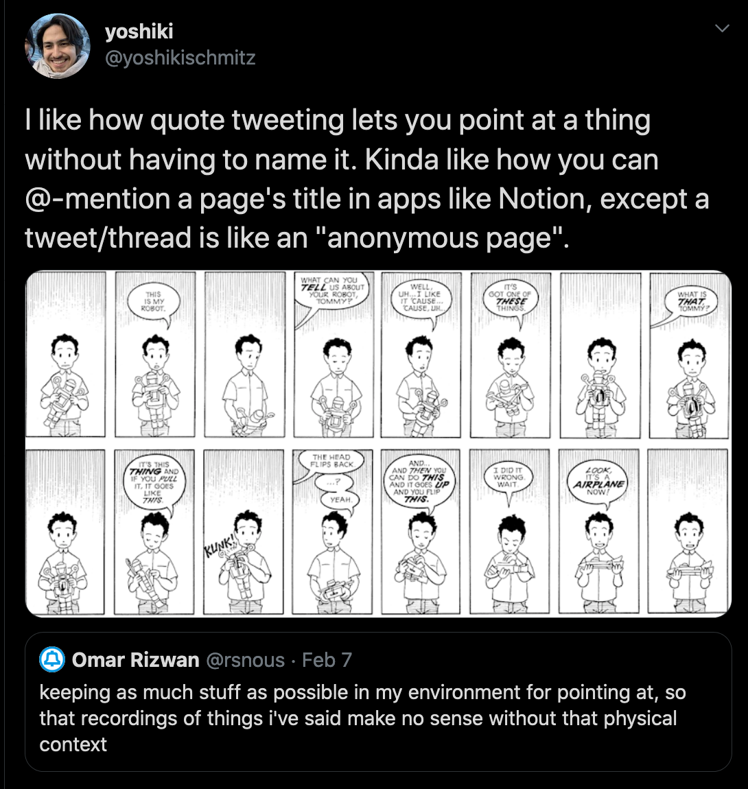
Naming everything is exhausting. Sometimes we just need to point to things.
Provenance Trails**
Small Code**
Plain and Friendly Language**
Blameless Error Notifications**
Dynamic Arrangements**
People develop ideas through connections. When solving problems, they need to see multiple things at once.
Notes: Unflattening simultaneity, comics
Therefore:
Allow any element of the system to be placed next to another element.
This can be accomplished via Ubiquitous Embedding, or any of the window managers: a Tiling Window Manager, a Scrolling Window Manager
Instant Publishing**
Multiplayer Mode**
Extremely Late Binding**
Disjoint Versions Living Harmoniously**
https://gist.github.com/pvh/6dd6f66c17f89e2a686f5b3026b7784f
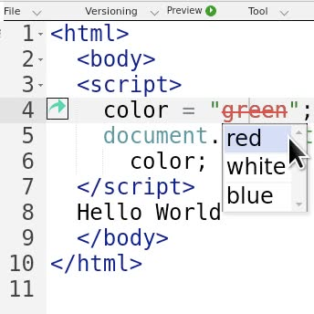
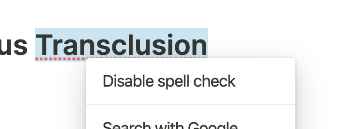
Customizeable Spelling Dictionaries
Collapsable Elements
Consistent Drag and Drop
Also make sure to visualize the drag and drop.
Multiple Composable Window Managers*
Tiling Elements
Scrolling Elements
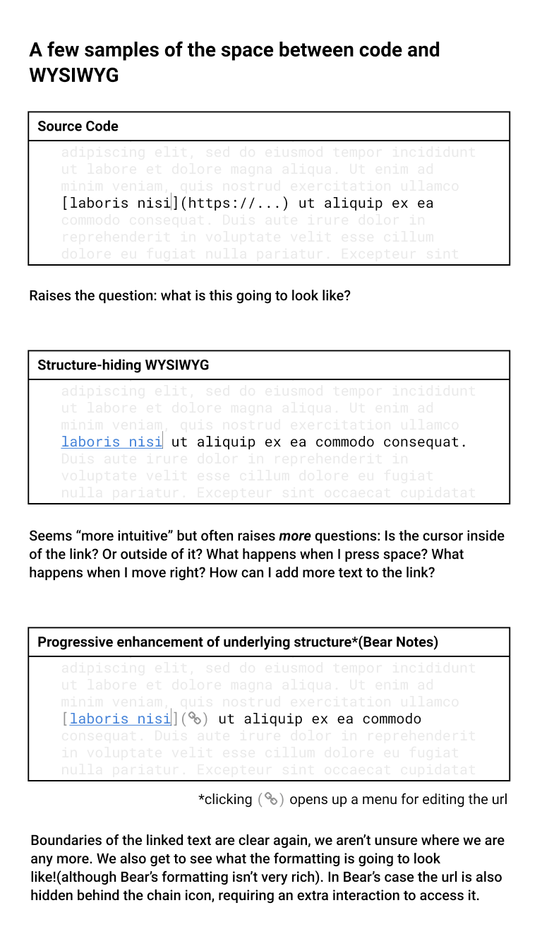
Visible Structure**
Use with Multiple Representations
Direct Manipulation*
Notes Anywhere*
Make sure they're searchable with search anywhere.
Multiple Representations**
Can use backlinks to point back to where they came from.
Can use sidelinks if we consider the representations to be part of a List of representations of the original Object.
Customizable Keyboard Shortcuts*
Streaming Pipes**
I ought to be able to stream the contents of a Notion node into Figma.
https://github.com/mawww/kakoune/blob/master/doc/design.asciidoc#composability
Made visible by: Visible Structure, Multiple Representations
Command Palette*
Use Reflection to find the commands available: https://github.com/p-e-w/plotinus
Backlinks**
Live Programming**
Potential Patterns
Breadcrumbs
Force: forgetting/losing context vs. the need to know where you are.
Batch Actions
Any action you can apply to a single item should be possible to do on multiple items. If the set is disjoint, group the actions first by the actions that are common to all items, and then show each group of actions next to a representative preview of the group.
Replace/Map/Filter
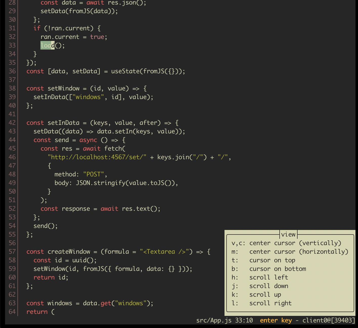
Consider Kakoune's approach to find and replace: rather than having a special "find and replace" command, we are given a "find" command, that given a string creates a list of selections, and a "replace" command, that given a list of selections, mutates them in place. Can we do something similar in this system, where users are given these generic tools to use? And scoping: is this a kind of selection?
https://twitter.com/yoshikischmitz/status/1309648874257039360
Workspaces
Continuous Chain of Action
Interruptions disrupt us, removing us from
Local Copies
To prevent link rot.
Going back
Ctrl+O in VIM. See also my tweets about Notion vs. Bear.
Multiple Devices
What are the forces a work here?
Provide many views of objects so they can be seen on your mobile device.
See: Embedding, Multiple Representations
Fast Search
Notes:
- maybe this could be expanded into a larger pattern about speed?
Ubiquitous Mentions
A kind of sub-pattern of Ubiquitous Embedding or Transclusions. Mentions are transclusions of names.
See also
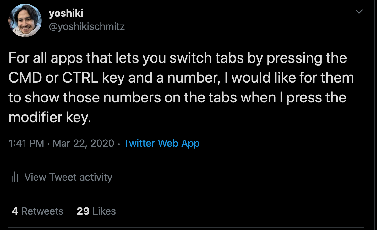
Visible Modifiers inside of Modes and Quasimodes
If I'm dragging a window, and there are keyboard commands avail. to me, show me those.
https://twitter.com/yoshikischmitz/status/1311115683640438785
https://twitter.com/jackrusher/status/1311207824635105280
Gradually Fading Training Wheels
Lightweight Processes
I should be able to create so many more Notion windows than I can - but I can't, because each one takes up hundreds of MB of memory. My computer only has 16GB of memory - most only have perhaps 4-8GB. It's impossible to have our thoughts flow freely if we are simultaneously being our computer's task manager.
Note:
Maybe an alternate title is Lightweight Processes.
- renamed to Lightweight Windows
Visible Performance Indicators
Give people fine-grained visualizations of performance issues. Have an escape hatch for when a process is taking up more than it should.
Inbox of Changes
Make sure they can Hide Any Element so they
Version Control For Settings Pages
A specific combination of ubiquitous version control and backlinks that feels worth calling out.
Detailed Activity Logs
See version control
Screentime Control
Kanban boards
There's something wonderful about these.
https://twitter.com/NanoRaptor/status/1281790133507780608
Objects shouldn't suddenly move
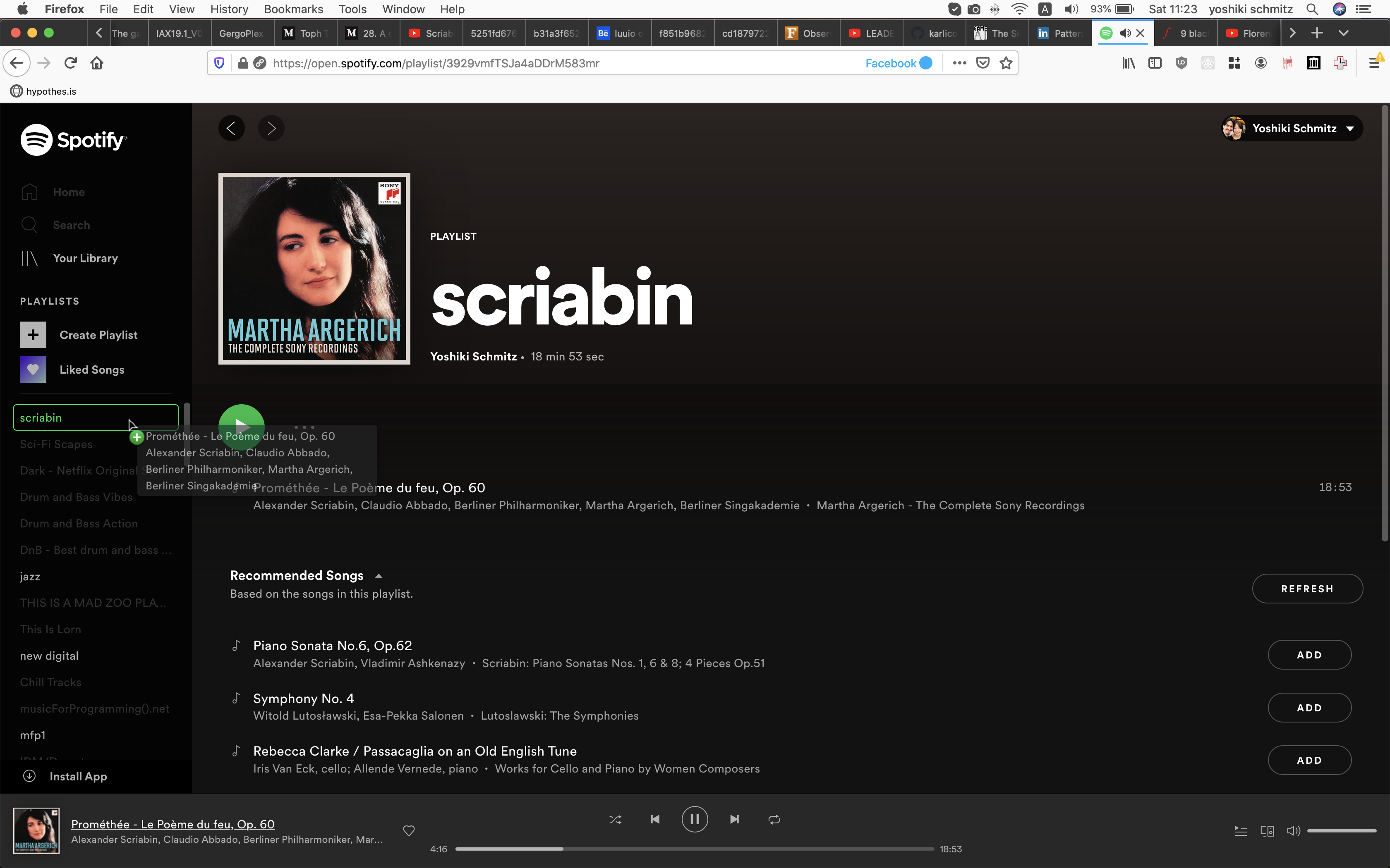
At first tycho-epoch was the 4th item, until I clicked play, when it immediately jumped to the top of the list. That felt weird, I felt no anticipation of what will happen when I clicked play. Maybe hovering over play should show me what's about to happen? Maybe it should react more slowly?

Prior Art
http://www.maplefish.com/todd/papers/Experiences.html#Garden of Windows
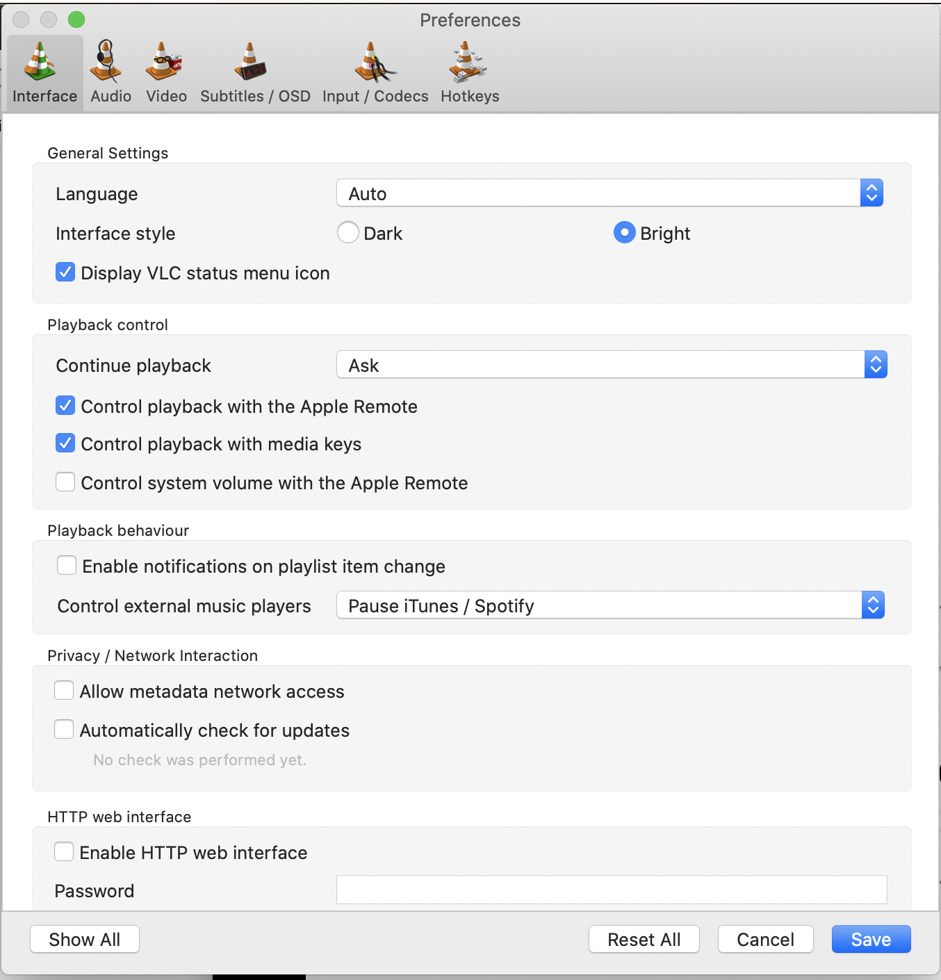
Modals like this shouldn’t exist
They create discontinuities of flow
