Email Redesign
This project was inspired by the following quote from Bret Victor's essay, "Magic Ink":
Even consider reading email. Most current designs revolve around the manipulation of individual messages—reading them one-by-one, searching them, sorting them, filing them, deleting them. But the purpose of reading email has nothing to do with the messages themselves. I read email to keep a complex set of mental understandings up-to-date—the statuses of personal conversations, of projects at work, of invitations and appointments and business transactions and packages in the mail. That this information happens to be parceled out in timestamped chunks of text is an implementation detail of the communication process. It is not necessarily a good way to present the information to a learner.

Inbox
- show me a calendar- so I can find emails from a certain day, a certain month, or a certain week. Let me step through time easily- It matters to me that I can find emails in the past from only a vague recollection of the time I received it. I should be able to go to January 5 2017, and then zoom out to the week or month, but also to step forward and backward, to the next day, or the day before. show me people - so I can find emails from my friends, significant others, and colleagues show me conversations - so I can find emails I'm actually engaged in. If I reply to a person frequently, then they're a much more important contact than accounts I receive promotions from. show my newsletters to me already opened, and in a stack each day - so I can glance through them quickly and find interesting information
- Show all of this information to me interleaved - If I want to find all the days that my boss contacted me last year, I should be able to see that easily. If I want to read through all the past issues of a newsletter, I should be able to do that with the same ease I can browse through old issues of magazines I have physical stacks of.
- The answer isn't more machine learning or extending email with crazy UI - it's just saner views.
- When I'm looking at an email, let me easily navigate to past and future conversations from that person. Make it obvious to me that I'm looking at a link in a chain - not an isolated orphan(unless it's the only email I've received from that sender - then make that obvious)
- Keep track of well-known brands and put them in their own bins.
- Keep track of all of my receipts - and parse and present the data as a proper ledger.
- Show me the emails that I haven't received responses for - so I can follow up
But let's step back for a minute
What do we use email for? "Sending email" is a myopic definition. Like Bret said, the sending and receiving is just an implementation detail of communication. The actual activities are what should drive the UI decisions. I use email to:
- Keep track of accounts I created on websites
- Contact people I think that can help me
- Submit my resume to jobs
- Exchange information and ideas with people- links, articles, photos
- Keep up to date with friends
- Find and reference old conversations
- Keep up to date on company developments
- Receive announcements from companies - I've signed up to learn when a game or a product is released.
- forwarding things to people - but often with parts omitted
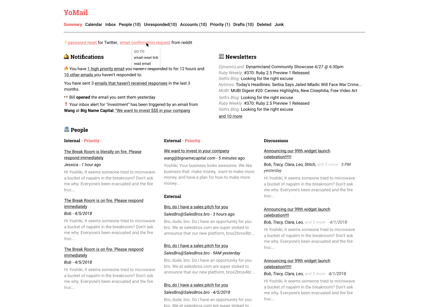
Start with a dashboard?
10 unread responses
Highlights:
Katy responded positively to your request to chat
10 new emails
Highlights:
Jacob from Sequoia is interested in investing
3 emails need follow up
10 opens in the last week
4 newsletter items
Category Ideas
- Cold emails
- look up the url in some company database, and if it's an important one then highlight it.
- Introductions